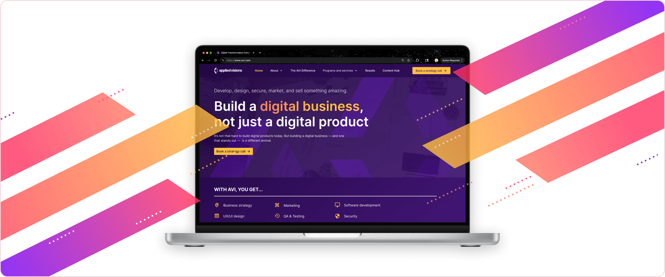
Project Overview
On my very first day at Applied Visions, I was tasked with completely rebranding the company for a modern audience. No big deal, right? It was an intimidating first project, but also launched me into understanding the complexities of my new company much faster than I would have been able to otherwise.
The Problem
The employees at AVI feared that, as an older company, their existing branding made them look like an aging company and out of touch with current trends. Additionally, as I found out through my interviews, employees felt that the branding didn't match the goals or energy of the company itself.
Research & Discovery
User Research
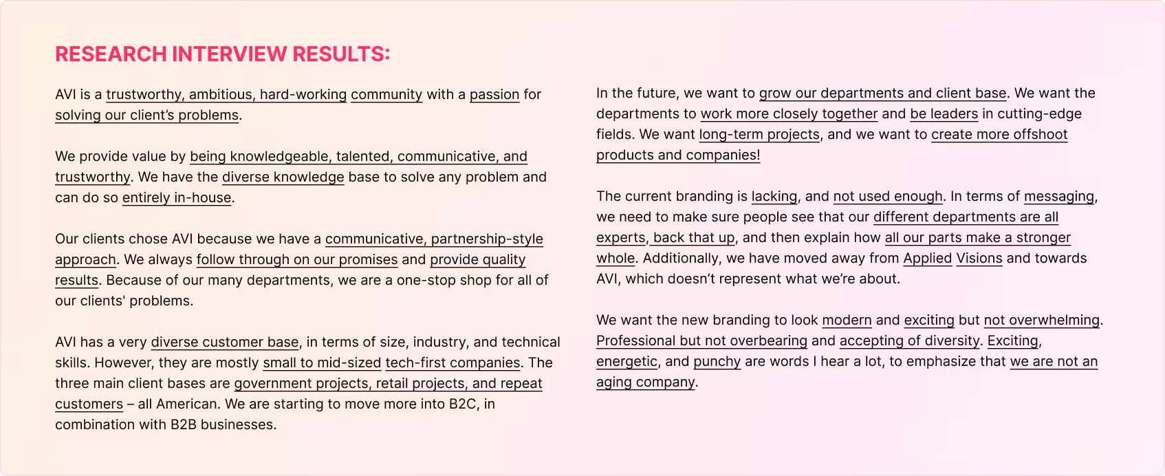
I kicked off with two weeks of informational interviews with key members of every team, to learn how they viewed our company, and what their dreams were for its future. This culminated in an extensive spreadsheet that I cross-referenced to find general “truths” to base my designs on.
Competitor Brand Research
In between my interviews I researched other tech companies and consulting groups of a similar size, as well as larger, extremely popular brands to create a brand that existed somewhere inbetween.
80% of sites online used blue as their primary color, especially in the tech sector. AVI's old color scheme was blue as well, but it didn't resonate with the teams goals of being 'exciting' and standing out from the rest. Due to its closeness on the color wheel, vibrancy, and connection with wealth and prosperity, we decided early on that purple would be the new primary color for AVI.
Design Process
Moodboard Creation
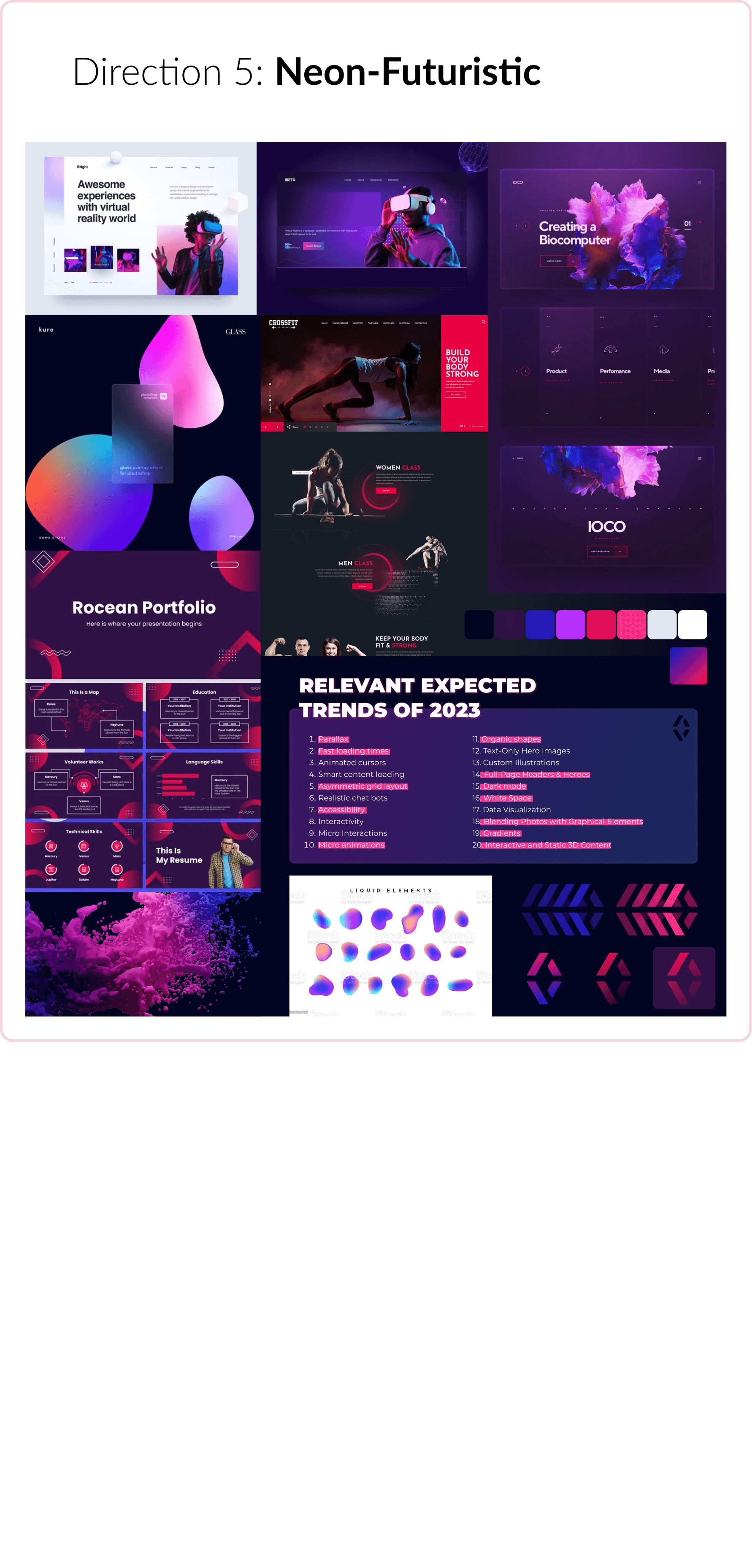
The first part of my design process is rapid iteration. For both web and branding projects, this often looks like moodboard creation. For AVI, I made five initial moodboards to match the feedback I had gleaned from my interviews.
The moodboard that was ultimately selected was #4, "Diagonal Purple".
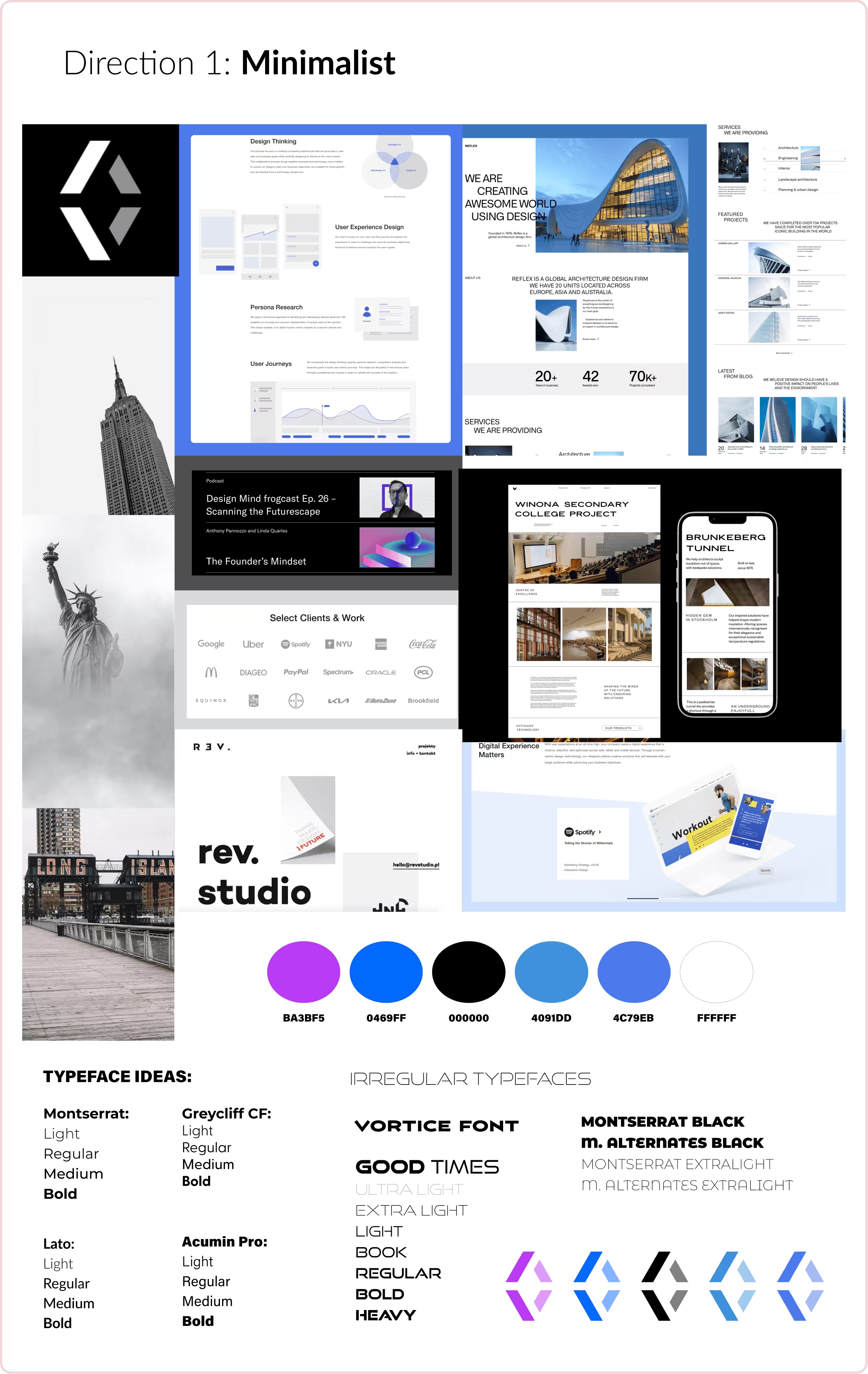
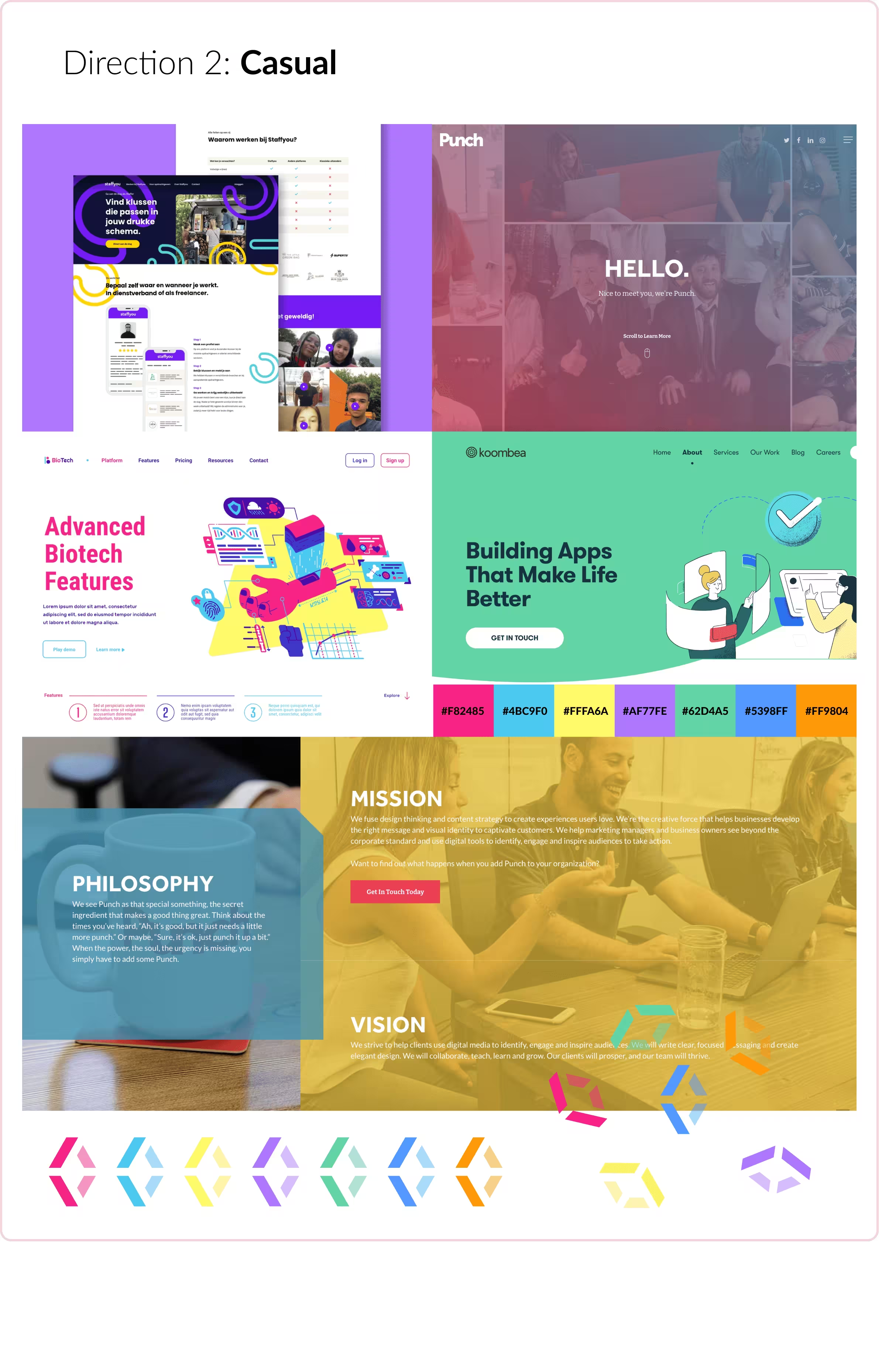
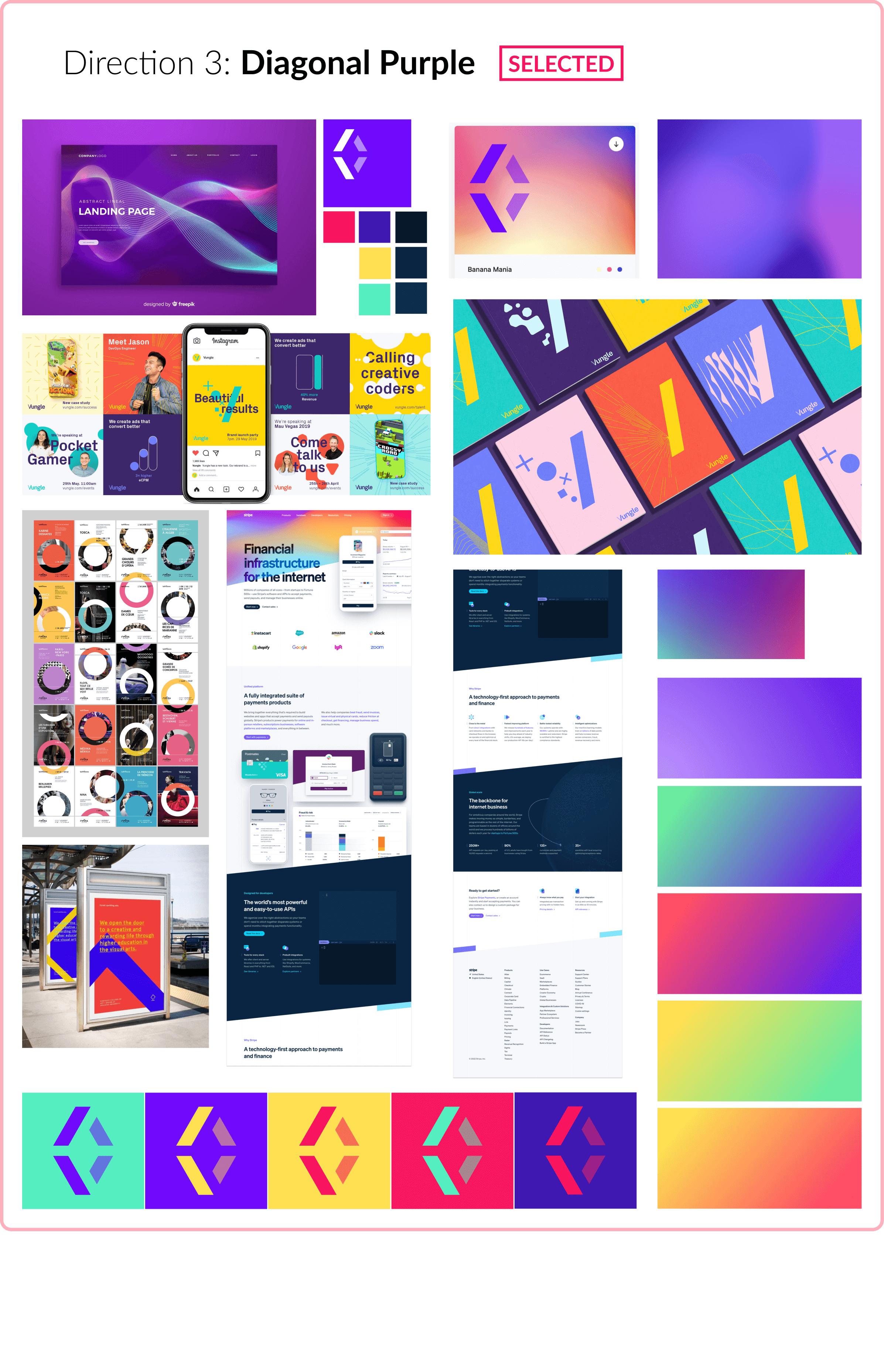
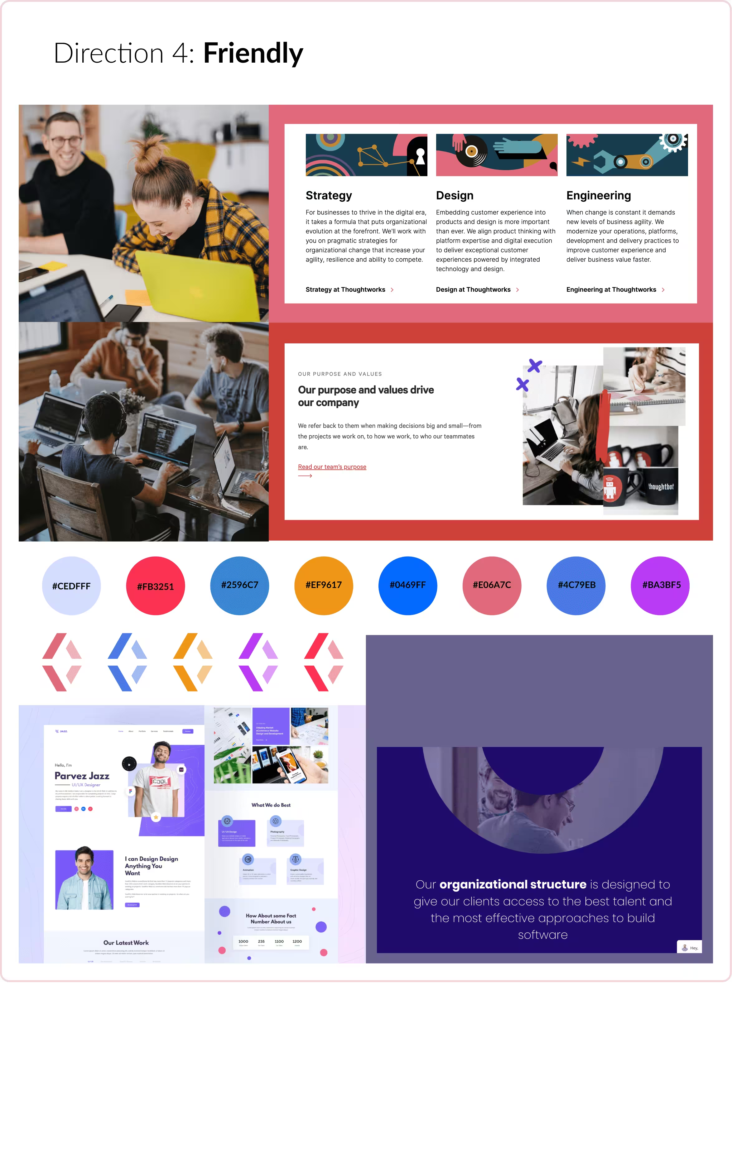
First vs. Second Refined Color Palettes
After the initial moodboard was selected, I extensively tested the application of the color palette to ensure that it fit our intended theme.
In doing this, I learned that the initial palette I had created felt too intense and not homogenous enough. I sought feedback on this, and came up with a second iteration, with a sunset of analogous colors instead. The clients much preferred this version, and it went on to become the final color palette selected for the brand.


Web Design Iteration
All of this work on branding was, of course, only the preamble to designing the website. Once the style guide was created, it was time to embark on the larger task of applying it to the site itself. The name of the game there was iteration once more, starting with the homepage and using that as the template for the rest of the site, reusing or reimagining blocks as necessary.
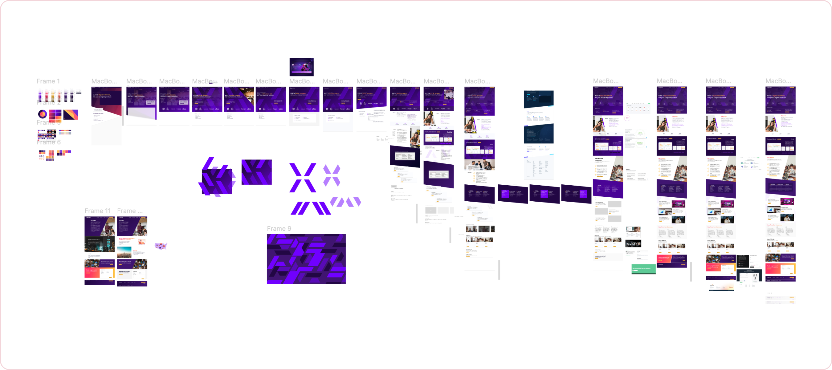
Initial homepage iteration (part one of many)
Final Brand Application
Final Brand Colors
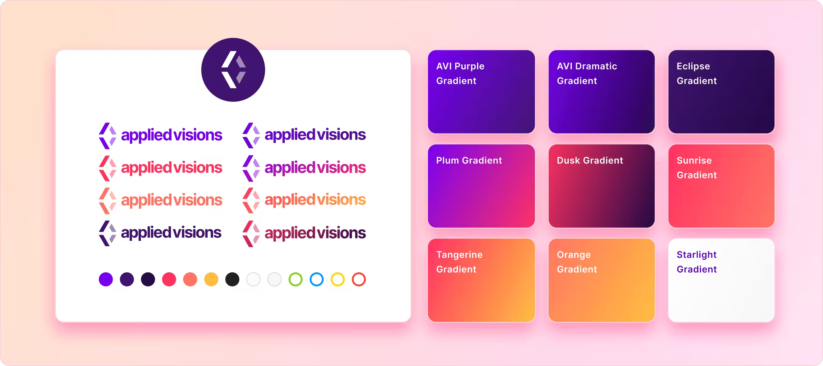
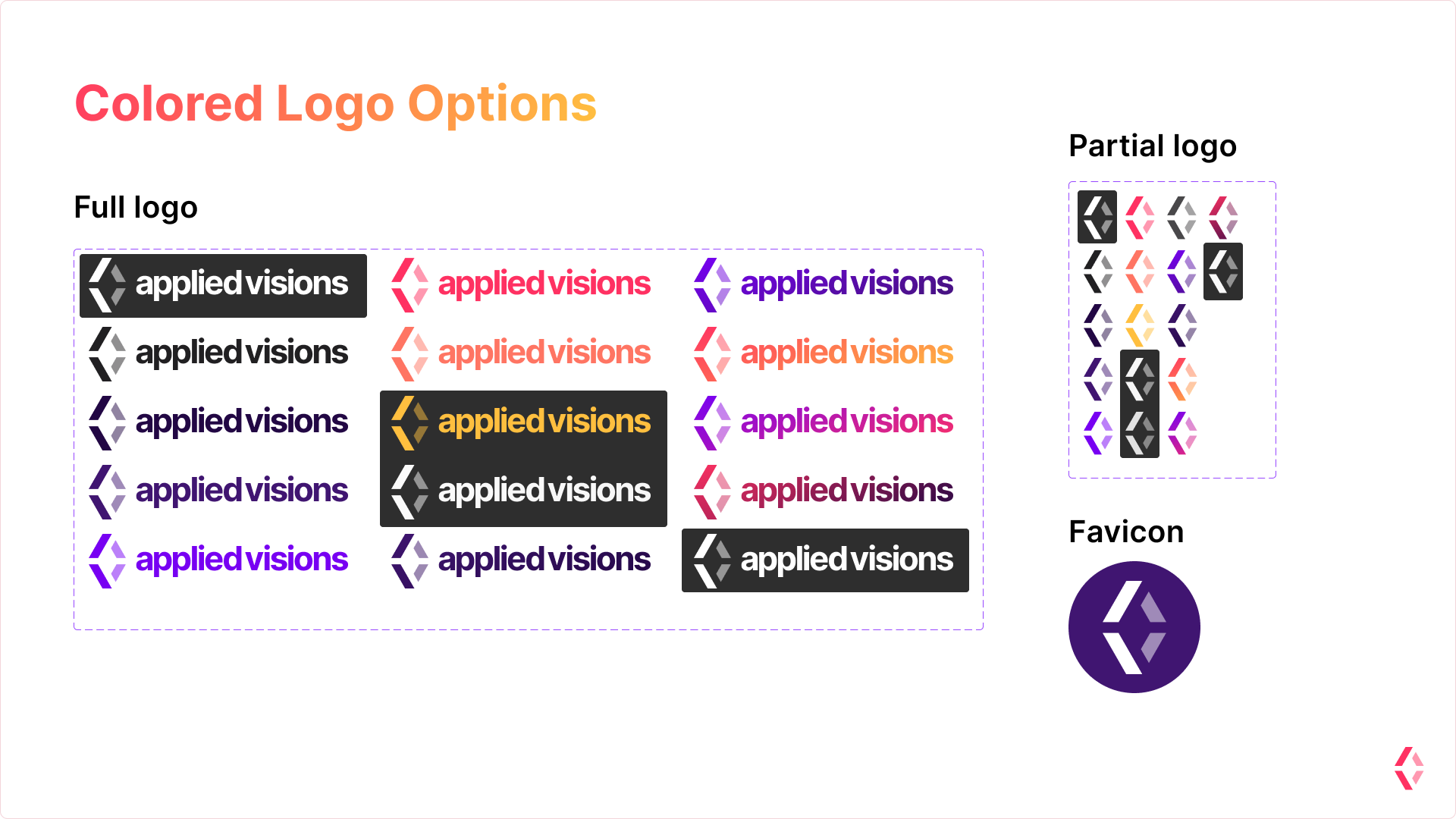
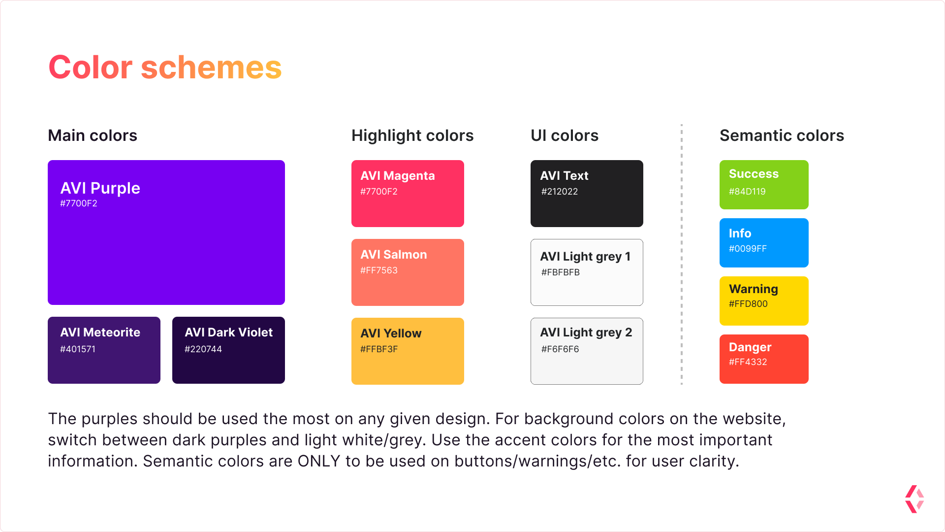
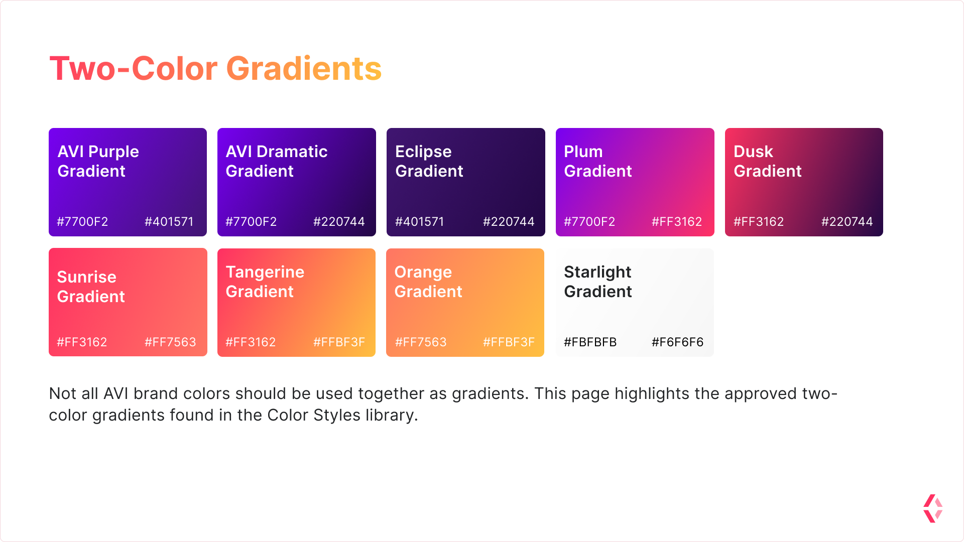
I took the 'sunset' brand colors we selected and created a style guide for my team's use, seen below. Included in this were rulings about logo use, and which brand colors were allowed to be used on light or dark backgrounds. I put the most effort into defining what the allowed gradients were, to discourage any bad color combinations from ever entering the design system.
As I was not sure the exact future uses of the brand, the style guide I created was brief, intended to lay down basic rules, and to be expanded later as needed.
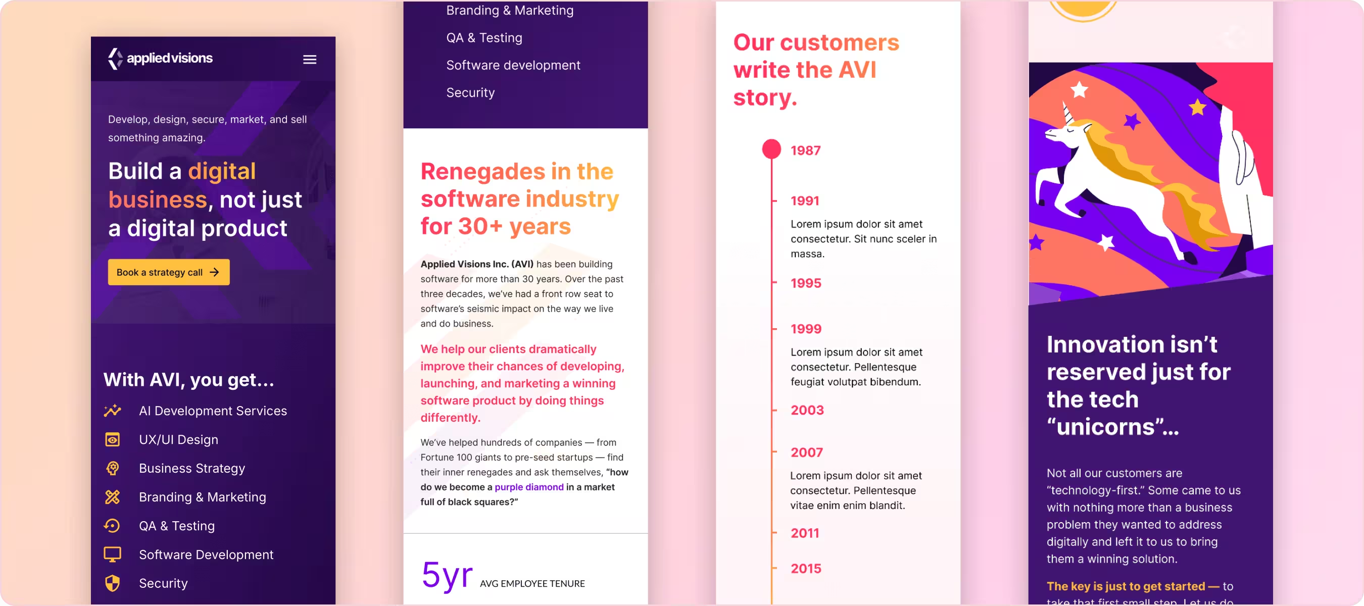
Responsive Website Design
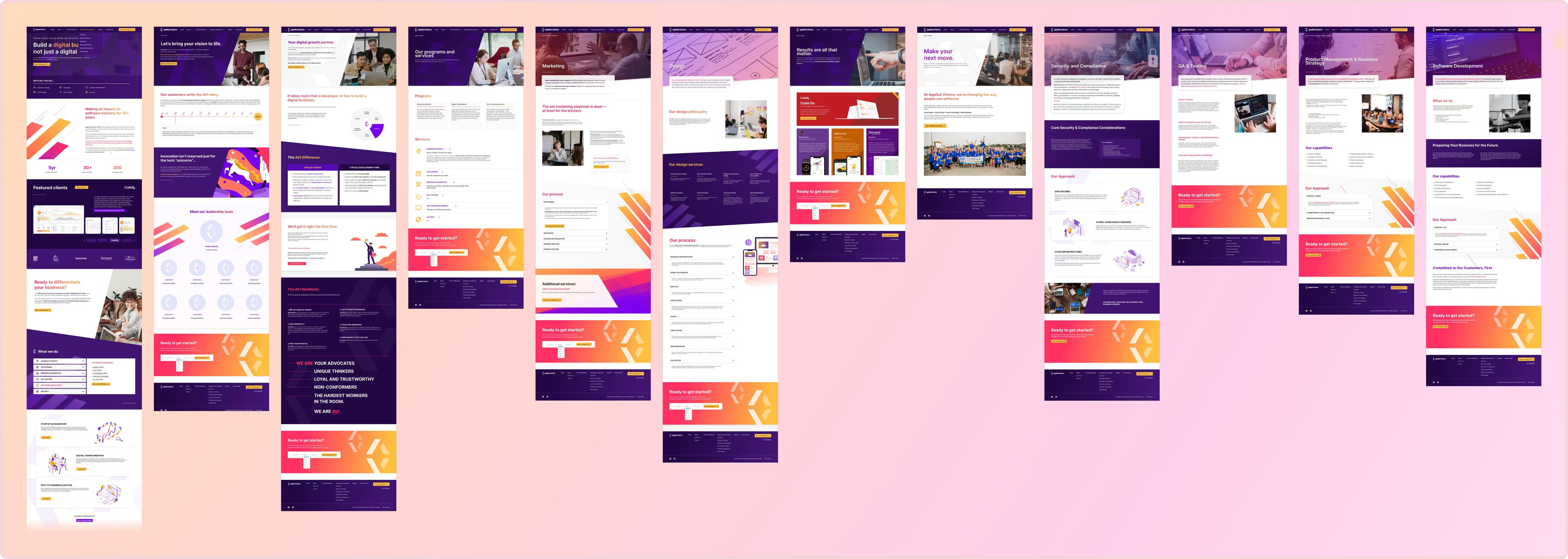
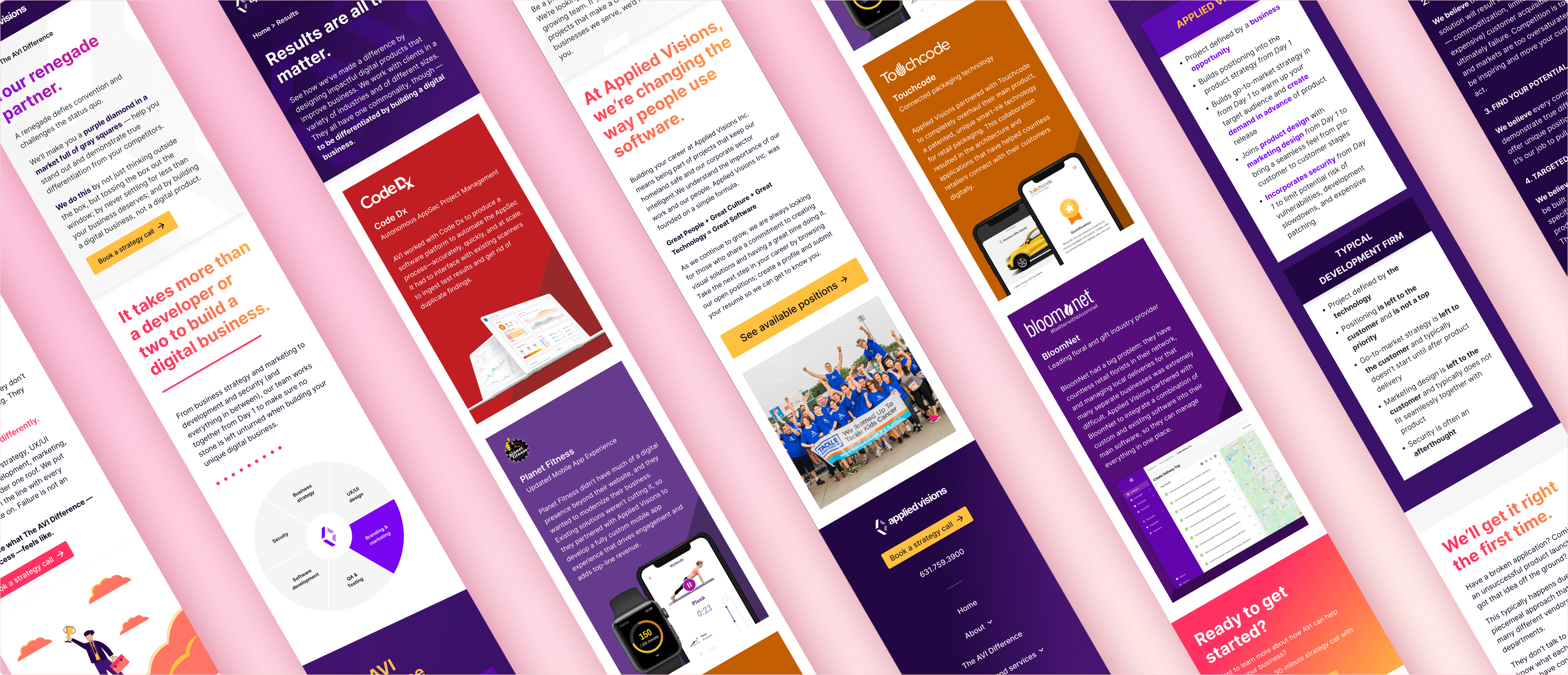
Once the brand direction & initial site iterations were completed, I was left with a set of modern, eye-catching site mockups for the dev team to build from, with my design oversight. Small changes were made to the site design after the initial launch, but overall the direction was a success that resonated with both my coworkers and our clients.

Expanded Brand Applications
After the initial site was created, I took it upon myself to create collatoral marketing pieces using the new brand. Shown below are some of those applications, not including the printed media that myself and other designers created as well.
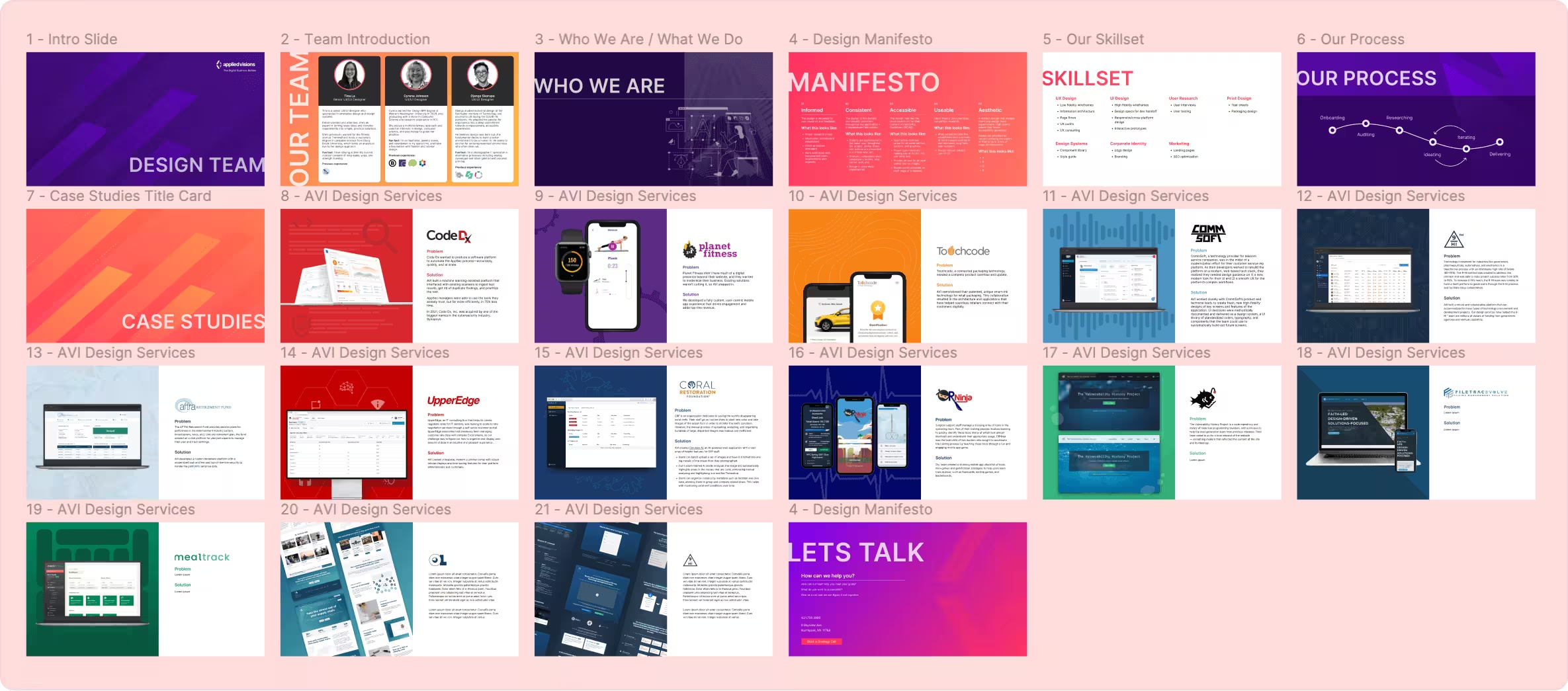
Marketing Pitch Deck
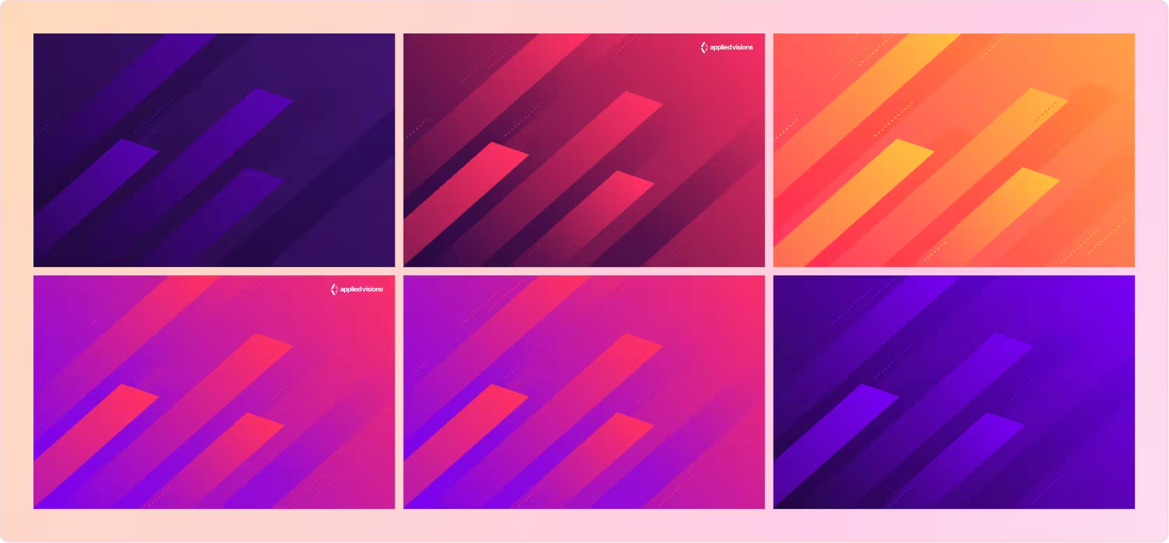
Desktop & Zoom Background Designs
Icons for Industry Sectors

Video Thumbnail Designs for Interview Series
Key Learnings
I built this site when I was first learning Figma, and when I came back to it for later iterations, I realized just how much time I could have saved if I had applied proper component libraries and framing — an oversight I learned not to make again.
This project was a lesson in working with teammates whose views differed from my own. I had no oversight on the copy of the site, something I had to accept as out of my personal scope. Instead, I committed myself to what I did have control over — the design itself.
I had the good fortune of working closely with a design-minded dev on this project, overseeing the implementation process, and advising on micro-animations and interactive elements in real time. I learned very quickly the importance of design-dev collaboration, which I advocated for in all of my projects afterwards.